Kitchen cabinets consume more visual real estate than almost any other element in a kitchen, they set the tone, anchor your design, and last for years. That’s why choosing the right cabinet color can feel like a high-stakes decision. Whether you’re refreshing outdated oak boxes or starting fresh in a new kitchen, the color you pick will influence how the space feels every single day. In 2026, homeowners are moving beyond safe whites and warm creams into bolder, more intentional palettes that reflect personal style while maintaining longevity. This guide walks you through fifteen trending kitchen cabinet colors and the reasoning behind each, so you can make an informed choice instead of guessing.
Table of Contents
ToggleKey Takeaways
- Kitchen cabinet colors set the tone for your entire kitchen—in 2026, homeowners are moving beyond safe whites into bolder, more intentional palettes that reflect personal style while ensuring long-term satisfaction.
- Neutral cabinet colors like greige, warm taupes, and soft grays remain the safest bet for resale value and longevity, offering versatility with any countertop or backsplash without clashing.
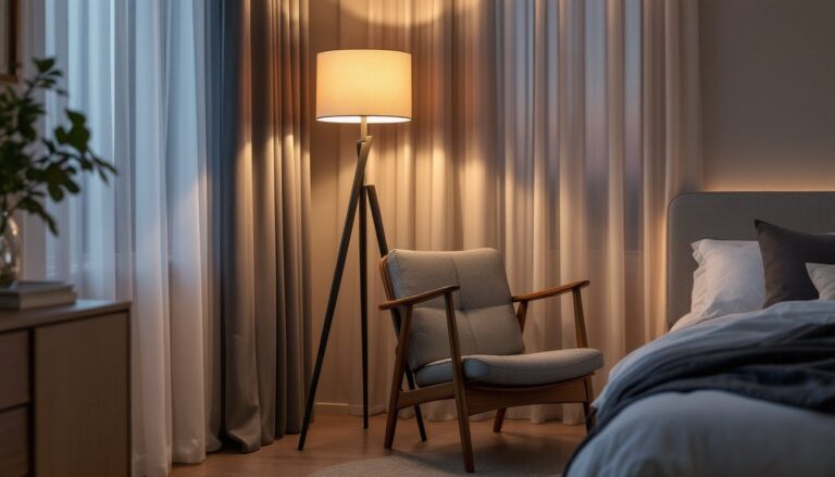
- Dark colors like navy, charcoal, and forest green create sophisticated, grounded kitchens but require excellent task lighting and more frequent maintenance due to showing dust and fingerprints.
- Soft pastels and muted earth tones—including sage green, dusty blue, and warm blush—are experiencing a resurgence as livable, personality-filled alternatives that age more gracefully than trendy saturated pastels.
- Two-tone cabinet designs, pairing neutrals with bold accents on islands or upper cabinets, deliver modern visual interest while keeping the overall kitchen feel calm and balanced.
- Lighting and existing kitchen finishes are critical to cabinet color selection—test paint samples on your cabinets at different times of day and live with top choices for at least three days before committing.
Classic Neutral Tones for Timeless Appeal
Neutral cabinet colors remain the safest bet for resale value and long-term satisfaction, and for good reason. Whites, soft grays, and warm taupes simply work. They reflect light, making kitchens feel larger and brighter, and they pair with almost any countertop, backsplash, or hardware without clashing.
True whites (pure or near-white) work best in kitchens with good natural light or bright task lighting overhead. They’re clean and modern but can feel sterile if you don’t warm them with surrounding finishes. Greige, a blend of gray and beige, offers the modern crispness of gray without the institutional coldness. It’s become the workhorse neutral of contemporary kitchens.
Warm taupes and soft grays with undertones (not pure cool grays) age better than trendy gray-tones that looked right in 2018 but now feel dated. When selecting a neutral, order large samples and live with them for a few days under different lighting conditions. Paint swatches on poster board and tape them to your cabinet doors: the Sherwin-Williams color deck and Benjamin Moore’s paint sample system are reliable starting points. Lighting changes everything, a neutral that’s perfect at noon might look green or purple at sunset in the same room.
Pro tip: If you’re refinishing existing cabinets, neutrals forgive imperfect prep work and application better than dark or bold colors, which show brush marks and dust more easily. You’ll need a primer-in-one or separate primer, and at least two coats of high-quality cabinet paint. A satin or semi-gloss finish (not flat) helps kitchen cabinets resist moisture and fingerprints better than matte.
Bold and Dark Colors Making a Statement
Deep navy, charcoal, black, and forest green are having a serious moment. Dark cabinets make a kitchen feel sophisticated, grounded, and intentional, not safe, but not reckless either. They’re especially striking in kitchens with white or light countertops and bright backsplashes that create contrast.
Navy blue is the most popular dark choice right now because it reads as professional and calming rather than heavy or oppressive. It pairs beautifully with brass or gold hardware and white subway tile or marble backsplashes. Charcoal and black require more careful handling: they show dust, water spots, and fingerprints, so plan on regular maintenance. They also absorb more light, which means your kitchen needs adequate task lighting, recessed lights, under-cabinet LED strips, or pendant lights over an island aren’t luxuries in a dark kitchen, they’re necessities.
Forest green and hunter green are emerging as alternatives to navy for homeowners who want depth without the cool-tone severity. These earthy darks feel less trendy than navy and work particularly well in kitchens with natural wood tones or brass accents.
If you’re painting dark cabinets, use a bonding primer (shellac-based or specialized cabinet primer) to ensure good adhesion, especially over glossy factory finishes. Dark colors typically need three coats to avoid streaking. Many professionals recommend Sherwin-Williams Emerald or Benjamin Moore Advance for cabinet painting, both offer excellent hide and durability, though they cost more and require longer dry times between coats. Budget extra time and patience.
Soft Pastels and Warm Earth Tones
Soft pastels, pale sage, dusty blue, warm blush, and creamy butter tones, are experiencing a quiet resurgence. Unlike the Instagram pastels of the early 2020s, these are muted, grounded, and genuinely livable. They add personality without shouting.
Sage green is the pastoral choice: calming, versatile, and sophisticated. It works with warm or cool undertones depending on the shade you select, making it forgiving in kitchens with mixed-tone finishes. Warm blush and terra cotta lean into earthy, Mediterranean aesthetics and pair beautifully with warm wood tones or mixed metals. These softer earth tones feel less trendy than true pastels and age more gracefully.
The key to pulling off soft pastels is avoiding artificial-looking saturation. Your cabinet color should almost look washed out next to the paint chip, that’s the sign you’ve found the right depth. Pair these colors with warm white (not pure white) trim, open shelving, and natural wood accents to avoid a sterile or overly precious look. Recent home decoration inspiration sources showcase how these softer tones work in real kitchens when paired thoughtfully with materials and lighting.
These colors forgive imperfections in application better than bold jewel tones because subtle variations read as character rather than flaws. They’re also easier to refresh or repaint down the road if your taste shifts, they don’t require primer-in-one systems or specialty finishes.
Two-Tone Cabinet Designs for Modern Kitchens
Two-tone cabinets, mixing two colors across your kitchen, are no longer a trendy gamble. They’ve become standard in contemporary kitchens, especially in open-plan homes where the kitchen flows into living and dining spaces. The technique breaks up visual weight, creates layers, and allows you to use bolder colors on smaller sections (like a kitchen island) while keeping the main wall cabinets neutral.
The most common split is lower cabinets in one color and uppers in another, or island in one color and perimeter cabinets in another. Less common but striking: cabinetry on one wall in a bold color while the rest stay neutral. Two-tone designs also work well vertically, a white lower cabinet with a gray or navy upper, for example, draws the eye upward and makes standard eight-foot ceilings feel taller.
Pairing Neutrals With Bold Accents
The safest two-tone combination pairs a neutral (white, gray, or greige) with a muted bold color. A white lower with a soft sage upper is approachable and modern. A greige lower with a deep navy island creates drama while the neutrals keep the overall feel calm. The rule of thumb: use the neutral on larger surface areas (perimeter walls) and reserve the bolder color for the island, single wall, or upper cabinets only.
When painting two-tone cabinets, you’re essentially doing two separate paint jobs. Use the same primer-and-paint system for both colors to ensure consistency in sheen and durability. Mask carefully where the colors meet, painter’s tape applied along the center line of a stile or rail prevents bleeding. Many DIYers find that hiring a professional for the masking and two-color application saves frustration and delivers a cleaner line, especially on flat-front contemporary cabinets where any imperfection is visible.
Most professionals charge $1,500 to $4,000 for cabinet painting depending on kitchen size, existing finish condition, and whether doors are removed and sprayed (cleaner) or painted in place. If you’re doing it yourself, allow 3–4 weeks for multiple coats and full cure time. Specific painted cabinet examples demonstrate how two-tone strategies work across different kitchen styles.
Choosing the Right Cabinet Color for Your Home
Color choice isn’t just aesthetic, it’s practical. The “best” color depends on your kitchen’s layout, lighting, existing finishes, and lifestyle.
Start by listing non-negotiables: If your countertops are granite or quartz with warm undertones, cool blues and grays might clash. If you have wood floors or natural wood open shelving, warm neutrals and softer tones tend to feel cohesive. If your kitchen gets minimal natural light, neutrals and warm tones open the space up more effectively than dark colors (though dark colors with excellent task lighting work fine). If you have young kids or a busy kitchen, white and light neutrals show fingerprints and spills more readily than mid-tone grays or soft pastels.
Considering Your Kitchen’s Lighting and Space
Lighting is non-negotiable in cabinet color selection. A rich navy that looks stunning in a showroom with bright LED lighting might feel gloomy in a kitchen with only overhead fluorescents. North-facing kitchens (cool natural light) pair better with warm neutrals and warm pastels: south and west-facing kitchens (warm, bright light) handle cool grays, blues, and greens more successfully.
Small kitchens benefit from lighter colors and finishes with some sheen (satin or semi-gloss) that reflect light and make the space feel larger. Open-plan kitchens flowing into living areas can use darker or bolder colors because they’re not visually isolated. If your kitchen is accessed from the entry, consider whether the cabinet color creates the impression you want visitors to have.
Order paint samples from at least two brands (Benjamin Moore and Sherwin-Williams are industry standards). Paint large poster boards with each sample and tape them to your cabinets at different times of day. Watch how the color shifts from morning light to evening. Live with your top two choices for at least three days before committing. Many kitchen design resources document these decisions and provide helpful frameworks for thinking through color in kitchen spaces.
If you’re hiring a professional painter, discuss color matching and scheduling carefully. Most painters require a 50% deposit upfront and completion timelines of 2–4 weeks depending on prep work, existing finish, and cure time. Ask about guarantees on adhesion and durability, reputable cabinet painters typically guarantee their work for several years against chipping and peeling.